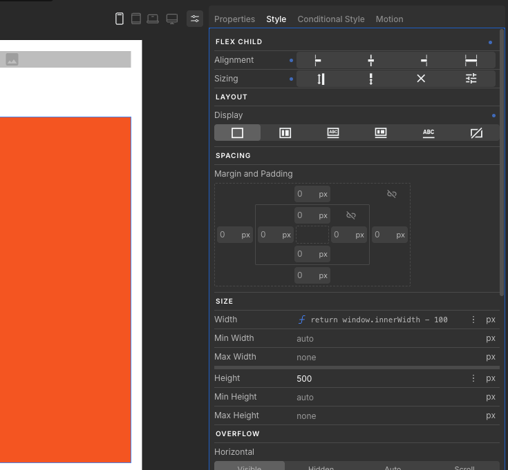
I’m using the mobile-first responsive strategy. I have a box whose width is controlled by a function, and on mobile it behaves as expected. However, when I try to override the width for larger breakpoints using a separate function, the desktop/tablet breakpoints continue to use the mobile function’s value.
It seems like the width function defined for larger screen sizes is being ignored entirely.
Here’s the Create setup for the mobile view (window.innerWidth - 100):
And for larger breakpoints (for the sake of simplicity, set to 500px):
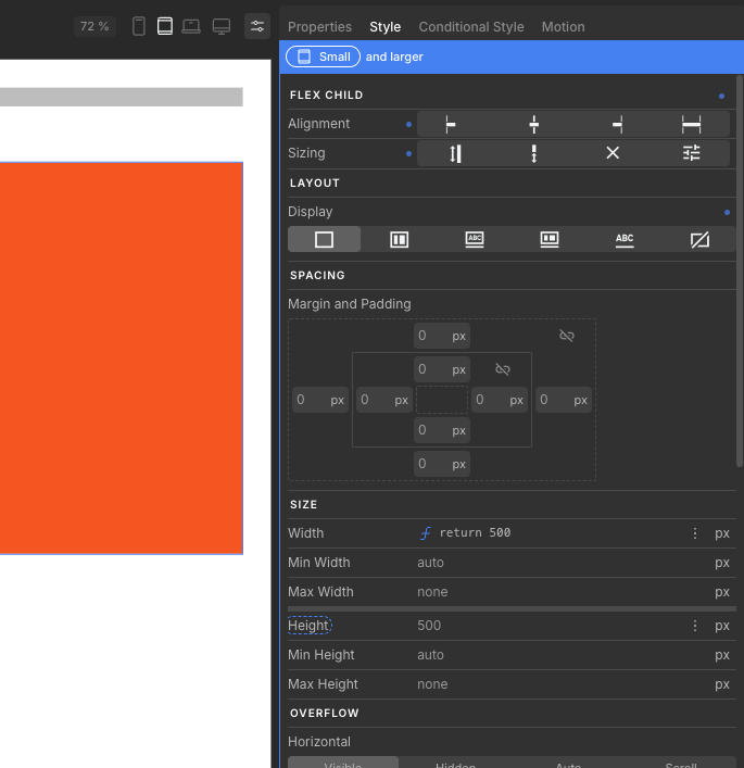
And a couple of screenshots showing the box always gets the value of screen width minus 100 px:

